Colors. Illusion or reality?
Click the color fields to copy the color HEX code to your clipboard. Also do that from the bar at the bottom of the page.
Pure White
Primary Background
hex code
PMS: Opaque White
RGB: 255, 255, 255
CMYK: 0, 0, 0, 0
Emplate Gradient
Emplate Gradient
hex code
PMS: Opaque White
RGB: 255, 255, 255
CMYK: 0, 0, 0, 0
Deep Blue
Primary Surface
PMS: 273 C
RGB: 20, 13, 83
CMYK: 100, 100, 28, 39
hex code
Fire Orange
Primary Accent
PMS: 716 C
RGB: 238, 113, 1
CMYK: 3, 68, 100
hex code
Deep Blue (80%)
Secondary Surface
PMS: 7672 C
RGB: 67, 61, 117
CMYK: 87, 87, 25, 11
hex code
Fire Orange (80%)
Secondary Background
PMS: 715 C
RGB: 241, 141, 52
CMYK: 2, 53, 91, 0
hex code
Deep Blue (60%)
Surface Help
PMS: 7667 C
RGB: 114, 110, 152
CMYK: 62, 59, 20, 2
hex code
Light Gray
Secondary Accent + Background
PMS: 663 C
RGB: 230, 233, 238
CMYK: 8, 5, 3, 0
hex code
Paper White
Secondary Background
PMS: None
RGB: 248, 246, 238
CMYK: 2, 2, 5, 0
hex code
Light Gray (20%)
UI Background
PMS: None
RGB: 251, 252, 253C
MYK: 1, 0, 0, 0
hex code
Grab our fonts
Visit free font libraries and download the fonts
we use here.
Drag, hold, drop
Drag any of these PNG Emplate logos and drop them into your presentation or design file.
Find more visual brand assets such as icons, illustration, mockups and brand manual in
a shared Google Drive folder.
Focus on typography
We humans get most of our information by looking at weird symbols. The better these symbols are put together in a layout, the easier it becomes for us to scan and receive information.
A company may have the nicest logo, cool animated illustrations, but if the typography sucks, the brand looks amateurish, and the readability gets worse.
Just a few rules and you are good:
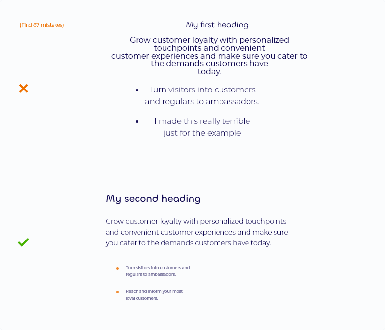
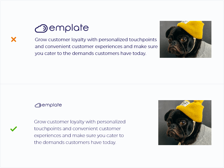
Keep enough space between headings
and paragraphs.
Keep text left-aligned. Limit center alignment to only when necessary.
Use contrast. Rarely make heading and paragraph text same size, color or weight.
Spacing
A good and simple to follow rule, that can make your presentations and layouts almost instantly much better-looking, is spacing.
Imagine that every element needs space around it to breathe.
If you put multiple elements too close to each other, they choke and create a clutter.
So make sure that when placing images and text, you give them enough breathing space. From each other as well as the sides of the page.
01. Intro
One of the key parts of our job is to position Emplate as a professional company in the eyes of potential clients and partners, and that way help prepare it for growth and expansion to new markets.
Branding is the essential subdiscipline of marketing. It is all that an individual or a group says, how they look, how interaction with them feels like and how people remember them.
We cannot control all of this unfortunately (or luckily), but we can control how we present ourselves.
They say "Do not judge a book by its cover", at least where I come from. But people rarely follow this saying. Individuals, groups and things get constantly judged based on their appearance and attitude. That's just how our brains work.
That is why we cannot stress enough how important a consistent, professional, and visually attractive presentation of our group really is. It can mean the difference between "This company looks shady" and "Wow". This initial though can, and will mean the difference when presenting and selling our services.
That is why we at Emplate do as much as we can to provide professional, consistent, and pleasant experiences for anyone who comes in touch. Branding, once created and implemented, becomes a soldier who at the front line fights to present Emplate,
even while we sleep.
The materials you find on this website are to help with correct brand implementation.